

Major in Body Bear 《Topic2: Relationship》
The very first studio album “Topic2: Relationship”, is inheriting from their last and first single “Topic1: Confession”. We do think the relationship is the first thing to clarify after the confession.
#The Core
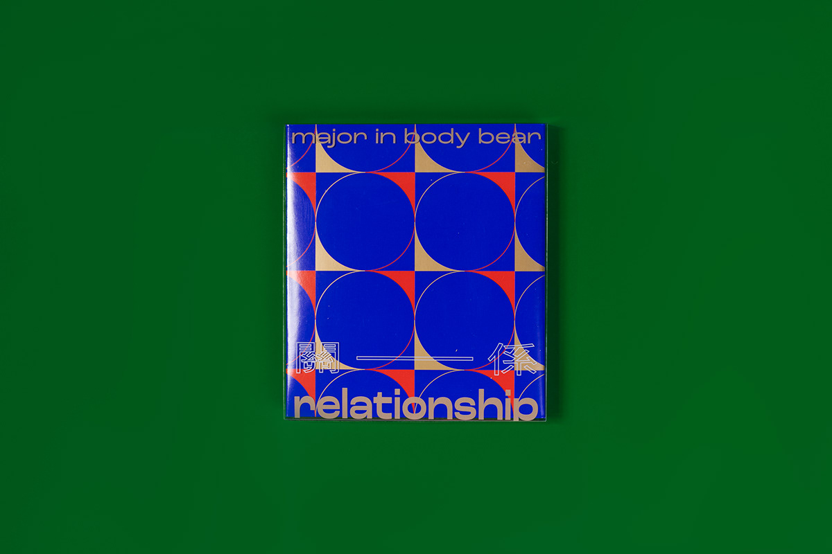
This time the concept core of our album begins with the sound wave, and our minimum basic unit is one quarter of a circle.
Major in Body Bear is a four-pieces band with four people, therefore everything is related with multiple. The one quarter of a circle represents the quarter note in music, and a full circle equals to 4 beats which means one instrument. Then the four-pieces turns into four complete circles which stands for Major in Body Bear. There is a curve out of the one quarter of the circle. When you time the curve twice, you would get a symbol of sound waves if you keep repeat them, and that just shows the music of Major in Body Bear.
#Visual Elements
Major in Body Bear is band without any lyrics, therefore everything of them is connected with their sounds and visual consist. All their behaviors are produced by pure music, so we design all the visual elements in the way of sounds to communicate the relationship between each other by the music of Major in Body Bear. After the Confession, the most important thing to keep each other close is the sound.
The two sound waves of the visual design stands for the stereo sound, bases on the left and right ears of we human.
Basically all the visual element are surrounded by the angle of pure music with no more extra decorations, only to present the pure and simple core of music.
#The Concept of Cover and Packaging Design
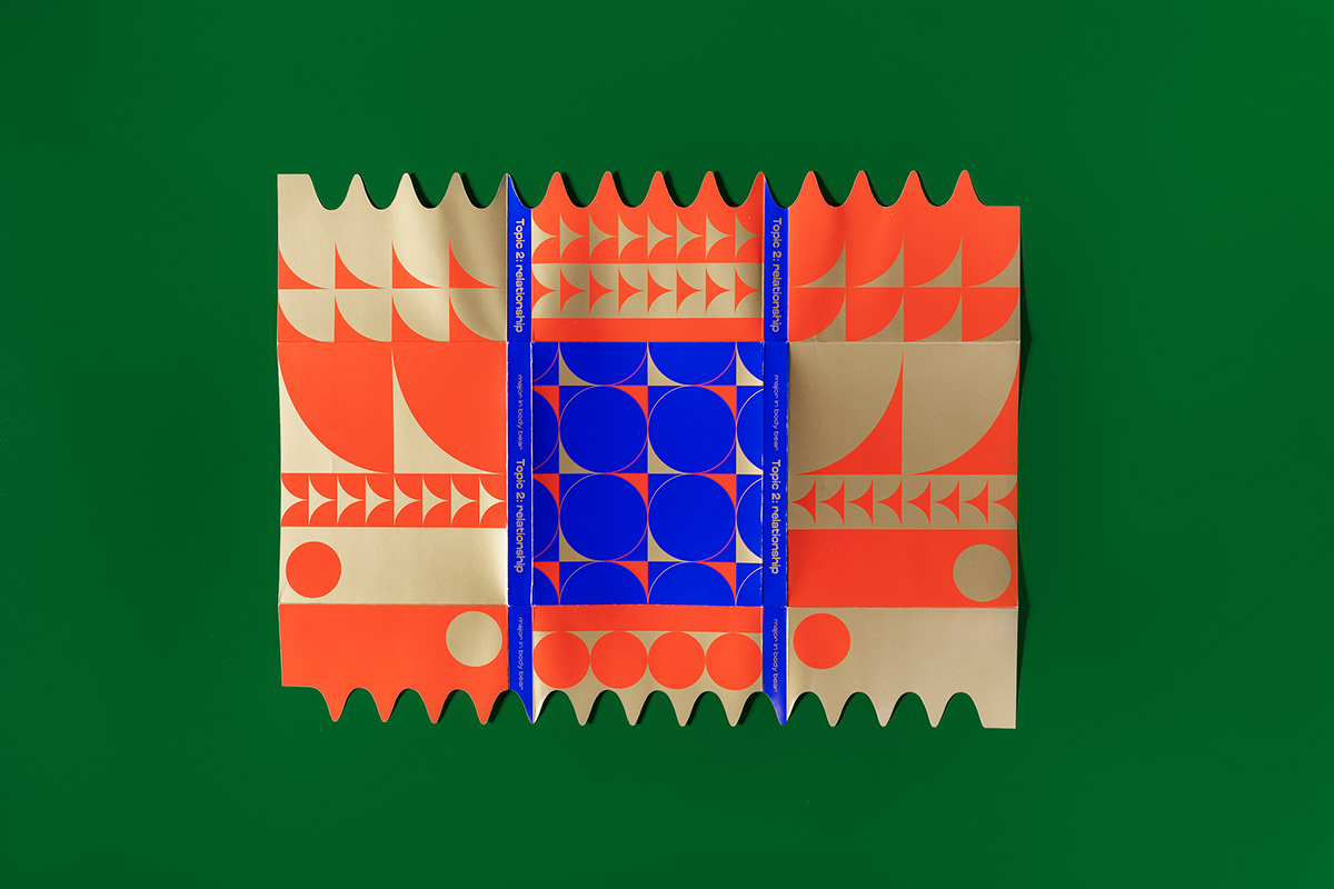
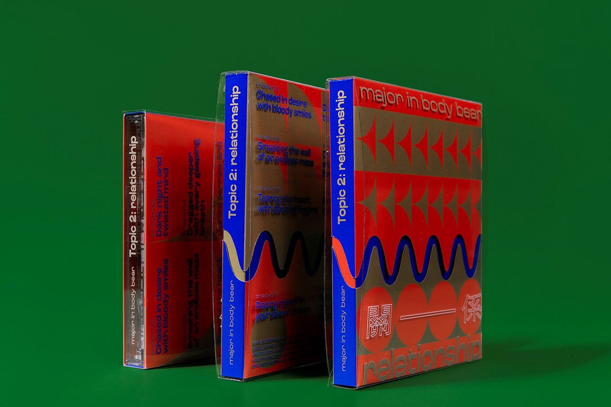
The double covers are used to show the relationship between two subjects, and the four cover backs stand for the four members.
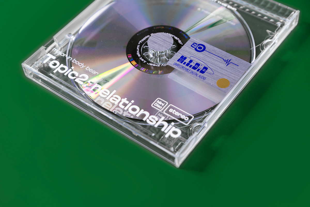
The acrylic case of the disk is the imitation we made to reproduce the sense of old MD disks. The CD disk nowadays is being stored with datas and music, but the MD disks were mostly used to save music datas. Therefore we choose the MD visual style to show the music-only carrier.
As our same old style is to maximize the creativity of the album design, this time we focus on the package ways of the album design to make it different with double covers and four cover backs. We hope the audiences could not only listen to the music of this album but also enjoy the pleasure and creativity of the packaging design.
*中文說明在最下方


體熊專科《Topic2: 關係 relationship》
體熊專科首張專輯【關係】,承襲第一張單曲【告白】之後,
我們認為突破僵局的告白之後所需要釐清的就是主角兩者之間的「關係」。
#專輯核心
這次的核心主軸從聲波出發,我們最小的一個單位是1/4的圓。
首先體熊專科是由四人四個樂器組成的編制,所以一切的規則都會有倍數關係,1/4的圓代表著1/4拍,一個圓形等於4個拍子表示一個小節也表示一個樂器,4個圓形就是4個樂器也就表示體熊專科。
1/4圓以外的部分會得到一個弧形,將這個弧形X2會得到一個聲波,重複這個聲波就會得到一個常見的聲波圖,這象徵的體熊專科的音樂。
#視覺元素
每一個環節都與聲音的視覺組成有關,其重點就是因為體熊專科是一個沒有歌詞的樂團,所有的表現皆由聲音來製作,所以我們將一切以聲音相關的視覺元素來設計,透過體熊的聲音來傳達彼此之間的關係,我們在告白結束過後,持續拉近彼此的重要元素就是聲音。
視覺的聲波有兩道也是表現立體聲的一個想法,是基於我們人類的左耳右耳構造。
基本上所有視覺元素都是環繞著純音樂的角度出發不需要帶著多餘的裝飾、修飾,只要將音樂最純粹的本質。
#封面與包裝設計概念
雙封面用來表示「關係」一詞至少是兩個主體間的事情,四封底用來表示四位團員所在的聲音面向。
放置光碟的壓克力殼,我們將整個仿製成以前MD的磁碟片感,主要是因為光碟可以存放資料或是音樂,但MD磁碟片幾乎都是存放音樂資料居多,我們想用這種方式來表現純音樂,只有聲音的載體。
然而我們一貫的風格依然是將專輯創意最大化,我們這次僅利用了包裝設計讓一張專輯能藉由包裝方式達成雙封面四封底的設計,這一個概念是希望讓聽眾在聆聽專輯的同時也能去享受包裝設計的樂趣及巧思!

